Animation/background Test and analysis
- willikoms
- Apr 14, 2021
- 1 min read

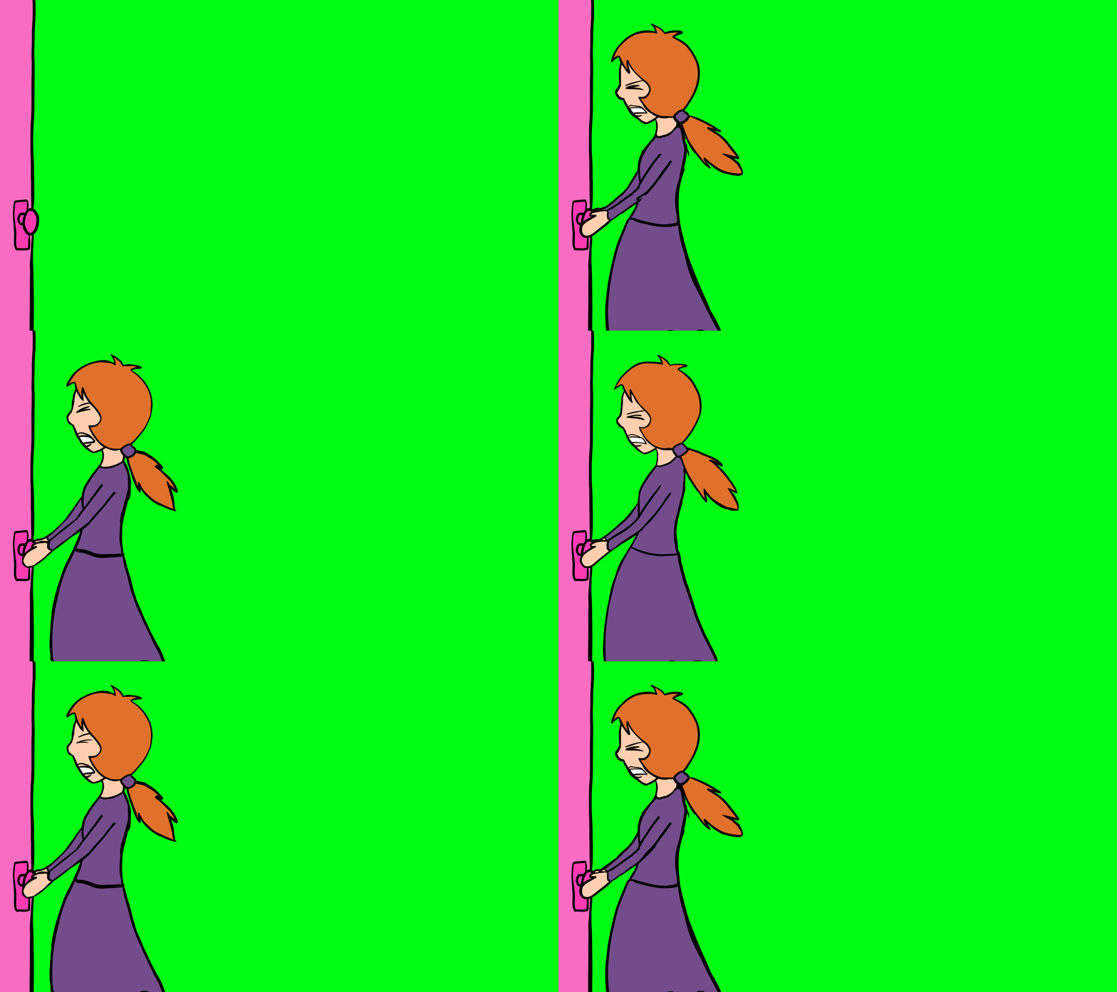
This is a testing shot to see how the fully coloured animation compares against my watercolour background. It is just a work in process as additional elements will be included later on. In terms of the style, I think the black lines and colour scheme work well. On top of that there is a clear distinction between how the character is digitally coloured and how background is painted. It still has that authentic old quality I wanted. As for the colours of the girl, I decided to go with ginger/strawberry blonde hair to contrast against the black better. It also works well with her purple clothes that compliment the shape and draws attention to the face.
I will admit that my previous worries of the animation blending too much in with the background seem to be unfounded as this has come out the exact result I wanted. There was an issue when it came to overlaying the animation on after effects though, as I couldn't export the procreate animations with transparent backgrounds. Plus exporting the different animation frames to then organise in the timeline would have taken too long. So what I had to inevitably do was to change the background to green and use colour key to make the video transparent. It took a while but I am happy that the results turned out decent.


Comments